
Choosing the right home color combinations can feel a little challenging. But if you want the whole space to feel cohesive, you don’t need to work with too many colors. The right pair of two or three tones can make a room feel warm, calm, and pulled together.
Warm, neutral-based combinations are especially easy to live with. They create a soft, inviting backdrop that works beautifully with almost any furniture and rarely feels dated. These home color combinations lean into warm whites, soft earth tones, muted greens, and natural wood — cozy palettes you can use across your living room, bedroom, kitchen, and beyond.
In this guide, you’ll find a range of combinations to help you choose the right colors for different corners of your home. Pick the ones that speak to you and use them as a starting point to build a home that feels warm and connected from room to room.
01
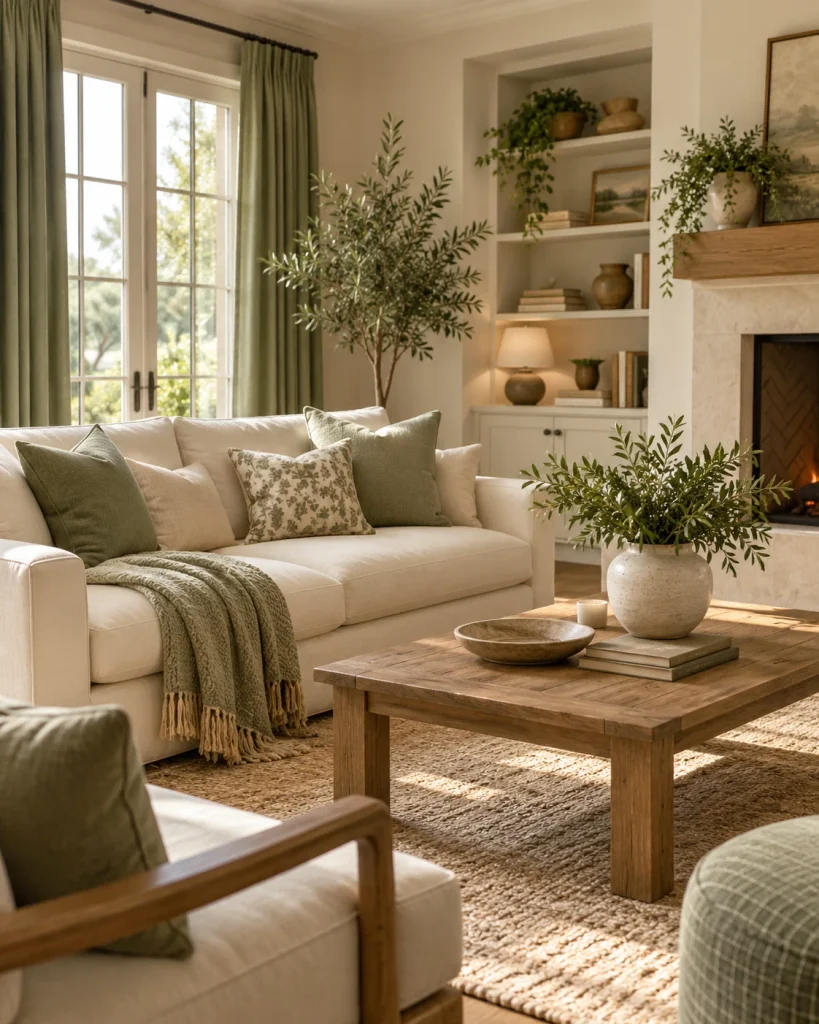
Cream and Sage Green
Cream and sage green is one of the most calming, easy-to-live-with combinations you can choose. The soft warmth of cream balances the gentle, muted green, creating a space that feels fresh but grounded.
It works beautifully when you want a cozy living room or cozy bedroom, where you want a restful, natural feeling. Use cream on the walls and larger pieces, then bring in sage through cushions, a throw, curtains, or a painted accent.
Add a touch of natural wood to tie the two together. This pairing feels timeless rather than trendy; almost any warm neutral furniture looks good against it.

02
Warm White & Natural Wood
If you want a palette that feels clean but never cold, warm white paired with natural wood is a beautiful match. The warm white keeps a room bright and open, while wood tones such as oak, walnut, and rattan add warmth, texture, and a grounded, organic feeling.
This combination is common in Scandinavian-inspired and modern farmhouse interiors because it’s simple, flexible, and calming. It suits almost any room, especially kitchens and living rooms.
Layer in a few soft textiles and some greenery, and the space can feel inviting without introducing any strong color at all. It’s also one of the easiest starting points if you’re nervous about using color.

03
Greige & Soft Brown
Greige — a warm blend of gray and beige — paired with soft brown creates a sophisticated, soothing palette that works in almost any home. It’s neutral without feeling flat, while the brown adds depth and a cozy, enveloping quality.
This combination is ideal for a bedroom or living room that you want to feel calm and slightly refined. Use greige as the main wall color, then layer in browns through leather, wood, and woven textures.
The result is warm and monochromatic in the best way — quiet, cohesive, and a soft backdrop that allows everything else in the room to stand out gently.
04
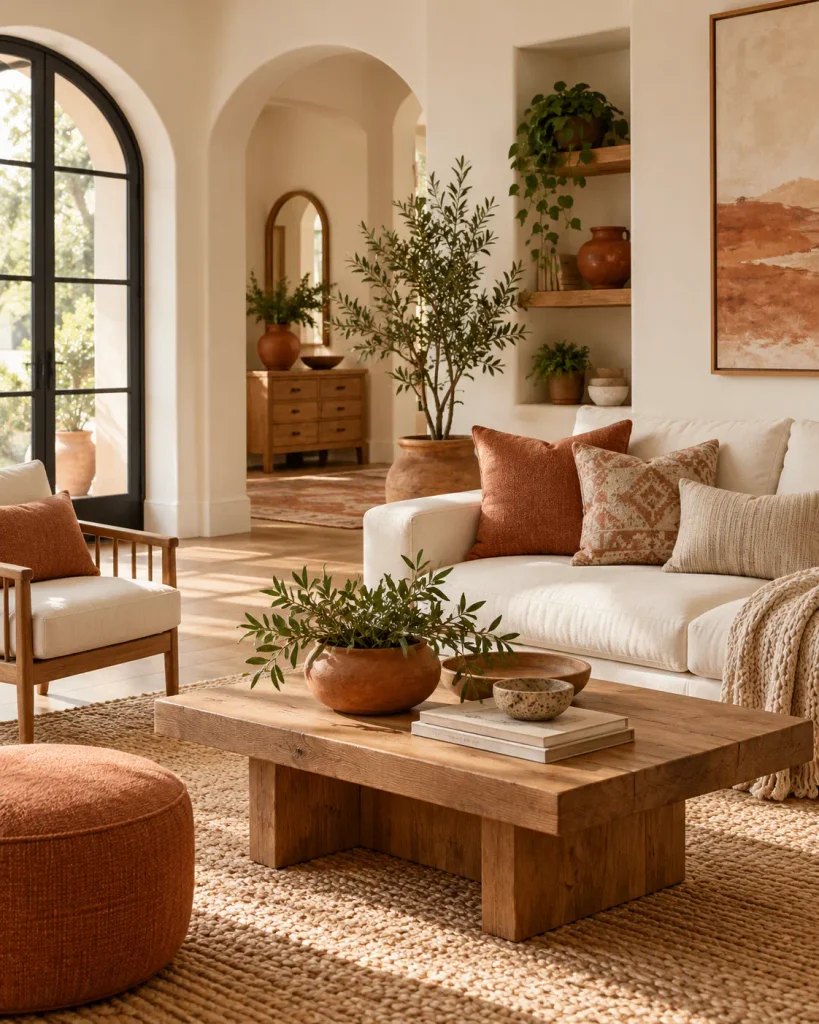
Warm White & Muted Terracotta
For a palette with a little more character, warm white and muted terracotta bring earthy warmth without feeling too loud. Terracotta — soft, clay-toned, and slightly muted — adds a cozy, sun-baked warmth that pairs beautifully with a warm white base.
This combination feels welcoming and relaxed, making it perfect for a living room, dining area, or entryway. Keep terracotta as an accent through cushions, pottery, artwork, or a single painted wall, and let warm white do most of the work. Add natural wood and a little greenery, and the space feels warm, earthy, and effortlessly inviting.
Terracotta also works well in entryway decor, where a little earthy color can make the space feel warmer from the moment you walk in.

05
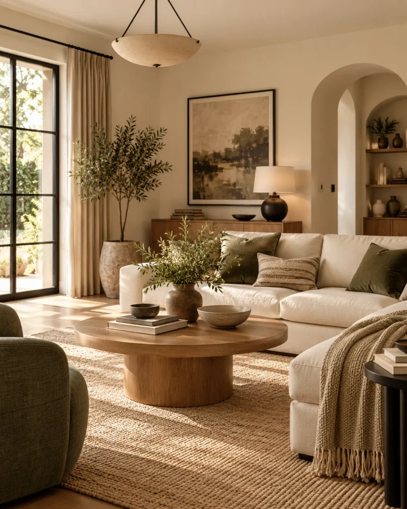
Beige & Olive Green
Beige and olive green is a grounded, nature-inspired palette that feels both cozy and timeless. The soft beige keeps things light, while olive adds a deeper, earthy richness that’s more interesting than a brighter green.
Together, they feel calm, organic, and warm — ideal for a living room, study, or bedroom. Use beige as the base and bring olive in through a sofa, curtains, cushions, or an accent wall.
Natural materials such as linen, wood, and jute complete the look. This combination has a settled, timeless quality, while the olive gives it just enough depth to feel considered rather than plain.
06
Cream & Warm Black
When you want a warm neutral palette with a little contrast and definition, cream and warm black is a classic combination. The soft cream keeps the space light and inviting, while black accents add structure, depth, and a touch of modern elegance.
The key is to use black as an accent through picture frames, lamps, hardware, or thin metal furniture legs rather than letting it dominate the room. A softer off-black or warm black often feels more comfortable than a stark, cool black.
This pairing works in nearly any room and suits both modern and traditional styles.

07
Taupe & Dusty Rose
Taupe and dusty rose is a soft, warm palette with a gentle, understated femininity that never feels overly sweet. Taupe — a warm greige-brown — grounds the delicate, muted pink so it reads as sophisticated rather than girlish.
This combination works beautifully in a bedroom, reading corner, or calm living space. Use taupe as the main tone on walls and larger pieces. Then add dusty rose through cushions, a throw, curtains, or bedding.
A little brass or warm wood keeps the palette from feeling flat. The result is soft, romantic, and calming — a warm neutral scheme with just a whisper of color.

08
Warm White & Forest Green
For a richer, more dramatic take on warm neutrals, pair warm white with deep forest green. The warmth of the white allows forest green to feel lush and grounding rather than heavy.
This is a bolder combination, so it works particularly well in a living room, study, or dining room where you want more depth and character.
Use forest green on a feature wall, sofa, cabinetry, or curtains, and keep the rest of the room light and warm. Brass accents and natural wood can make the green feel even more elegant and timeless.
It’s a classic, slightly moody palette that still feels warm and welcoming.
09
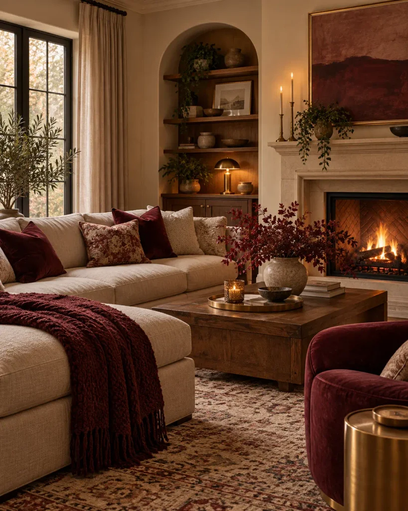
Soft Beige & Burgundy
Soft beige and burgundy is a warm, inviting palette with a cozy, slightly traditional feeling — perfect for cooler months but still beautiful year-round. The light beige keeps the deep wine-red tone of burgundy from feeling too heavy, while burgundy adds richness, warmth, and depth.
This combination suits a living room, dining room, or bedroom where you want a snug, enveloping mood.
Use beige as the base and bring burgundy in through cushions, a throw, an area rug, curtains, or artwork. A little gold or warm wood complements both colors beautifully.
It’s a timeless, comforting pairing that feels rich without becoming overwhelming.
10
Warm Gray & Cream
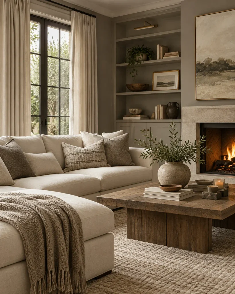
Warm gray and cream is a soft, versatile palette that feels calm and effortlessly elegant. Unlike cooler grays, a warm gray with beige or brown undertones pairs naturally with cream to create a soothing, cohesive backdrop.
This combination is ideal if you love neutrals and want a space that feels serene and uncluttered. Use the two tones throughout the room, layering different textures to keep the palette from feeling flat — think a cream sofa, warm gray cushions, a soft throw, and a textured rug.
Add wood and greenery for extra warmth. It’s a quiet, flexible palette that works in almost any room and suits a wide range of interior styles.
11
Oatmeal & Rust
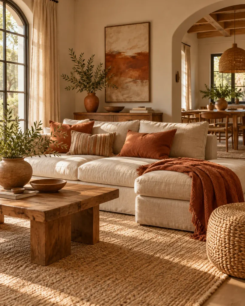
Oatmeal and rust is a warm, earthy palette with a relaxed, welcoming feeling. The soft, creamy oatmeal tone pairs beautifully with rust — a deep, warm orange-brown that adds coziness and just enough boldness.
Together, they feel natural and grounded, making them ideal for a living room, entryway, or dining space. Use oatmeal as the base through walls, upholstery, and larger pieces, then bring rust in through cushions, a rug, pottery, or artwork.
Layering natural materials such as jute, wood, and linen reinforces the earthy feeling. This combination is warm and welcoming with enough color to give the room character.

12
Ivory & Caramel
Ivory and caramel is a warm, soft palette that feels rich and comforting without relying on strong color. The creamy ivory keeps the space light, while caramel — a warm golden-brown — adds depth and a cozy, honeyed warmth.
This combination is beautiful in a bedroom or living room where you want a soft, enveloping feeling. Think caramel leather, warm wood, tan textiles, and woven details against an ivory backdrop.
It’s a tonal palette that feels calm and quietly luxurious, and because it stays within warm neutrals, it’s incredibly easy to live with and style. Add a little greenery to keep the room feeling fresh.
13
Soft White & Sage With Brass
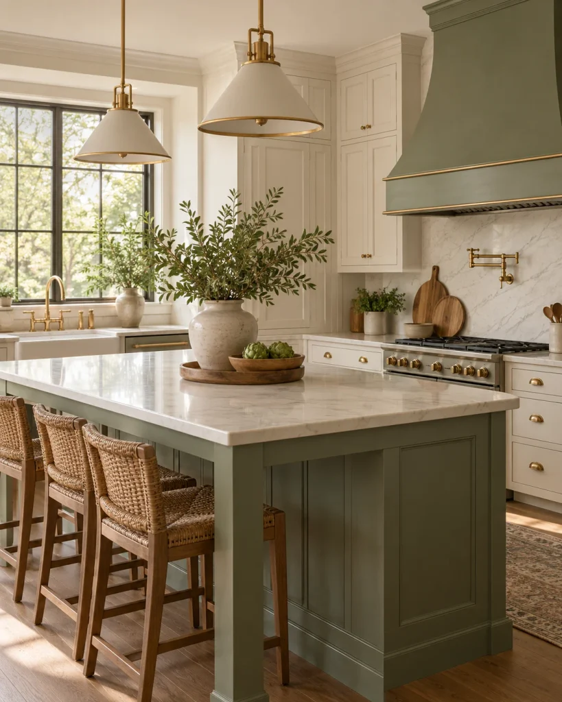
A soft white and sage green palette lifted with brass accents is a fresh, elegant combination that feels both calming and refined.
The white and sage create a light, natural base that feels soothing and easy to live with, while brass adds a warm golden glow that elevates the entire look. This works beautifully in a kitchen, bathroom, living room, or even a home office.
Use white and sage across walls, cabinetry, upholstery, and larger pieces, then bring brass in through hardware, lighting, frames, or small accessories.
The metal keeps the soft palette from feeling flat and introduces a subtle sense of luxury. It’s a timeless warm-neutral combination with a polished finish. This same combination can also bring a polished, calm look to a cozy home office, especially with warm wood and soft lighting.
14
How to Use These Color Combinations in Your Home
A few simple principles can help any of these palettes work. Start with one main color — usually a warm neutral — for your walls and largest pieces. Choose a second tone for medium-sized elements such as a sofa, curtains, bedding, or cabinetry, and use a third color as an accent through cushions, artwork, decorative objects, and smaller details.
You don’t need to use every color in equal amounts. Let one tone lead the room while the others support it. Carry one or two shared tones from room to room so your whole home feels connected, even if each space has its own character.
And don’t forget texture. Wood, linen, wool, jute, ceramic, and woven materials can give warm neutral palettes more depth and keep them from feeling flat. The goal isn’t to make every room look exactly the same. It’s to create enough visual connection that moving from one space to another feels natural, warm, and cohesive.
